Graphic designers might not want to change their font, but customers surely want a different look to the text they see.
Everyone is tired of Helvetica, even if they like it; there are many alternatives to this font, which can be used by graphic designers all over the world.
The reason why people use Helvetica so much, especially graphic designers, is because it looks clean, has a bold texture to it, and is legible. However, sometimes brands need to change their text, and spice up things.
Typefaces
Most people know typeface as font; however, it is much more complicated than this. To understand the alternate types of Helvetica, it is best to first learn about typeface and its use.
A typeface can be best defined as a set of characters, which are of the same design. These letters don’t necessarily have to be alphabets; they can be numbers, punctuation marks, and even symbols.
There are so many typefaces that we use in our daily lives, or even see them around us, but are unfamiliar with what exactly they are. These typefaces are Arial, Helvetica, Times, and much more.
When someone buys a computer, they see different typefaces on their system; these typefaces can be large and look sharp, and shouldn’t be confused with the font.
This is because, a font is of a specific size and typeface; for example, Arial is a typeface, but when you make it bold and change its size then it becomes a font. Even though it is a small difference, and most people won’t really pay attention to it, but learning about such things can prove to be helpful.
Typeface or typography is very important for web designers and graphic designers. This is because, they need to come up with the right typeface for a website or a brand, which would then become its identity.
Such professionals have to make sure that they make the right choice in terms of typeface so that they don’t end up confusing the target audience.
There are some terms that every graphic designer knows about when it comes to the typeface.
Height
The height is important in typeface because it defines the lower case letters. This could be the height of two letters in a typeface, like ‘e’ and’.
Ascender
This is the stroke of a letter, which comes from the Mean Line. For example, the upper part of ‘I’ and ‘l’ are ascenders, because their stroke of the line is above the mean line.
Descender
This is the stroke of a letter, which you will find below the baseline. For example, letters like ‘y’ and ‘p’ are descenders, as their stroke is below the line.
Mean Line
As mentioned above, a mean line can be defined as a line, which decides the height of the lowercase letters. On the other hand, the baseline can be described as the imaginary line, where the rest of the letters.
Body Size
This refers to the size of the typeface; it is measured from the end of the ascender or the descender.
Set Width
This is the space between two letters, which can vary from letter to letter. It isn’t necessarily the same for both letters.
Cap line
This is the height of the capital letters, and it mainly depends on the font cap line. This could be taller, shorter, or the same as the ascender line.
10 Best Alternative Typefaces to Helvetica 2025
Akzidenz Grotesk
The name of this font can be a mouthful, but it is one of the best alternatives for Helvetica font. This font was founded in 1898, and it is one of those fonts that came before Helvetica. This is the font that started the neo-grotesque movement, which started in the 20th century.
Originally, this font is inspired by the other typefaces of Swiss Style. It is a much smaller and rounder font, which is less dense compared to its successors. The look of this font is clean and neutral; simultaneously, it seems to be a friendly font, which is more approachable.
If you want to know where you might have seen this font, then look no further than the American Red Cross, which uses it in its logo. In the 1970s, the New York subway system also used this font. However, it was soon replaced by Helvetica, because the ‘J’ is clearer in Helvetica font.
Neue Hass Grotesk
This font was designed in 1957, and the designer was Max Miedinger. He used to work with Haas’sche Schriftgiesserei, which is in Switzerland.
The art direction of the font was completed by Eduard Hoffmann. This font was mainly designed after the popularity of British and German grotesques.
It won’t be a stretch to say that Helvetica font shares a typography DNA with this font. However, this font caters to different fonts and users, mostly to those who want to use softer and graceful curves in their writing.
The typography of this font is such that, it gives letters more varied width, and has a natural italic look to it. Moreover, there are 44 fonts in the family of this font alone.
Univers
Univers are probably the only typeface, which can be easily pronounced. It was inspired by Akzindenz and is more of a fresh take on it.
This was released in 1957 and is similar to Helvetica because it is smaller and spaced out. While Helvetica is bold, Univers are smaller and don’t attract much attention.
When someone is using this typeface, they will see the subtle variations in its stroke width and the variety that is found in most letterforms.
This makes the typeface more interesting. It also pulls the font out of its neutral zone, which is something that Helvetica occupies. There are different weights and variations in this typeface, as Univers is usually described with a 55 regular weight and width.
Now the most interesting thing is that we see Univers typeface almost every day around us, but don’t recognize it. You will be surprised to know that Univers was used on the Apple laptop keyboard, until 2007.
It is also used currently in the logo of the Bay Area Rapid Transit system, along with Frutiger. Also, this typeface is used by Frankfurt International Airport, as well as the Montreal Metro System. So, it will be easy to spot Univers, if you want to see how it looks like.
Aktiv Grotesk
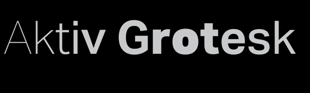
This is sans-serif typeface, which was released with the help of Dalton Maag, in the year 2010. At times, Aktive Grotesk is described as Helvetica killer, because the designers wanted to create something that resembled Helvetica and Univers, and they came up with this typeface.
It has a very clean and minimalist look, and it is mostly used for the title, menu cards, the body of text, or footers.
When people use this typeface, they often combine it with other types of faces like Abril Display and Lora.
FF Bau
FF Bau typeface is designed by Christian Schwartz; it was designed for Font Shop International, in 2002. This typeface is basically a modern take of Helvetica and has a lot in common with it too.
This typeface was specifically designed to suit the modern typeface needs, without changing the personality of Helvetica too much. The ‘a’ and ‘g’ of this font in lowercase, is what differentiates it the most from Helvetica.
This typeface has about 8 weights, and it comes with matching italics. It can be used in a newsletter or billboards; it is a clear typeface.
ARS Maquette
This typeface was designed in 1999, and it was available for commercial purposes in 2001. The typeface has been developed by Angus R Shamal and was created as a flagship for ARS Type. ARS Maquette is pretty much known for its simple and clean look.
It is stylish, but its look is very simple and it doesn’t confuse the reader in any way. This typeface comes from a five weight family, which was advanced until 2010. There are italics in this typeface, and it is very readable as well.
This is an alternate typeface to Helvetica, because of its modern yet simple and stylish look. In fact, the designer of the typeface himself defined it as something very simple in nature.
Proxima Nova
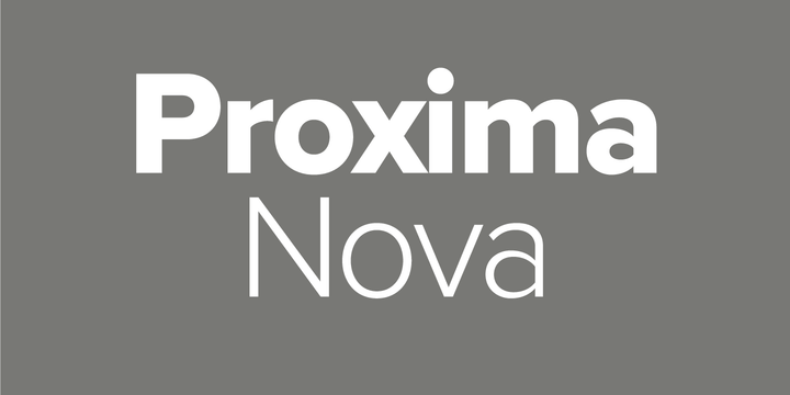
This one typeface is inspired to bridge the gap between two other typefaces; Futura and Akzidenz Grotesk. These two typefaces combine modern proportions, as well as geometric looks and feel. This was established in 2005 and was pretty much a reimagining by the creator, Mark Simonson’s, of a typeface that was created years ago.
There are six fonts in this family, and it is a very impressive font; there are 8 weights, and 3 widths in it. It comes with true italics and rational curves. There are uppercases and lowercases in this typeface, which are very playful and quirky.
When someone writes the lowercase ‘a’ using this typeface, there is an upward-aimed bowl, which is very unique in nature. There are so many details in this typeface, which is why it is a really good alternative to Helvetica.
Proxima Nova typeface is mostly used by websites like BuzzFeed, NBC News, and Wired. This is because it is perfect for digital media websites, mainly due to its roundness and geometric appearance.
National
National is a very simple typeface, but it is also equally effective and humble. This is a New Zealand based typeface and has a very subtle touch to it.
The characters and details are well built in this typeface, and it is a perfect homage to sans-serif typefaces before Akzidenz Grotesk was made available for commercial use.
The designer of this simple, yet humble typeface is Kris Sowerby, and he won a Certificate of Excellence for National. The certificate was given by the Designer Club in 2008, and it gave a boost to this typeface. There are accents, numerals, and forms in this typeface, with small caps of all styles.
Brandon Grotesque
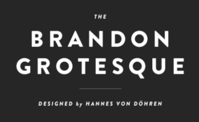
This typeface creates a balance between sharp and pointed apexes. The stems are rounded, and there is a smooth feeling to Brandon Grotesque.
This typeface is often spotted in thinner weights, but as they belong to the bolder family, they are the perfect alternatives to Helvetica.
If someone wants to know about their history, or where they are inspired from, then they would definitely find a hint of geometric sans-serif in it.
The typeface has an Art Deco style, and it brings its own style to the table as well. There are 12 fonts, and even if the family of this typeface seems a bit limited, it still won an award in 2011, by TDC. The weights of the font are perfect because they are balanced properly.
Slate
This typeface is created by Rod McDonald because it is elegant and very pleasing for the eye.
When Roc McDonald created this typeface, he was basically drawing inspiration from Toronto Life magazine, and Nova Scotia College of Art and Design. The two families of this typeface were created solely for these two organizations.
The soft aspect of this typeface was sent to the magazine, and Slate became the result of it. Slate can be best described as a humanist sans serif, which is very beautiful, and legible. This type of typeface is very consistent and doesn’t look like it is engineered out of the blue.
Conclusion
The typeface is very important because it can either attract a person from reading what is written on a poster or a website or give them a headache. Imagine if the typeface that a website manager uses on their website, and it is small and not clear at all, then the number of visitors to the website would be less.
Helvetica is such a popular typeface because people can easily understand and use it anywhere they want to. The above-mentioned typefaces are of similar nature and can be used by graphic designers.
Graphic designers would find the above-mentioned typefaces helpful, if they want to recreate the interest of a customer or a visitor, in their product description or website.
Read more: Alternatives of Keepvid